
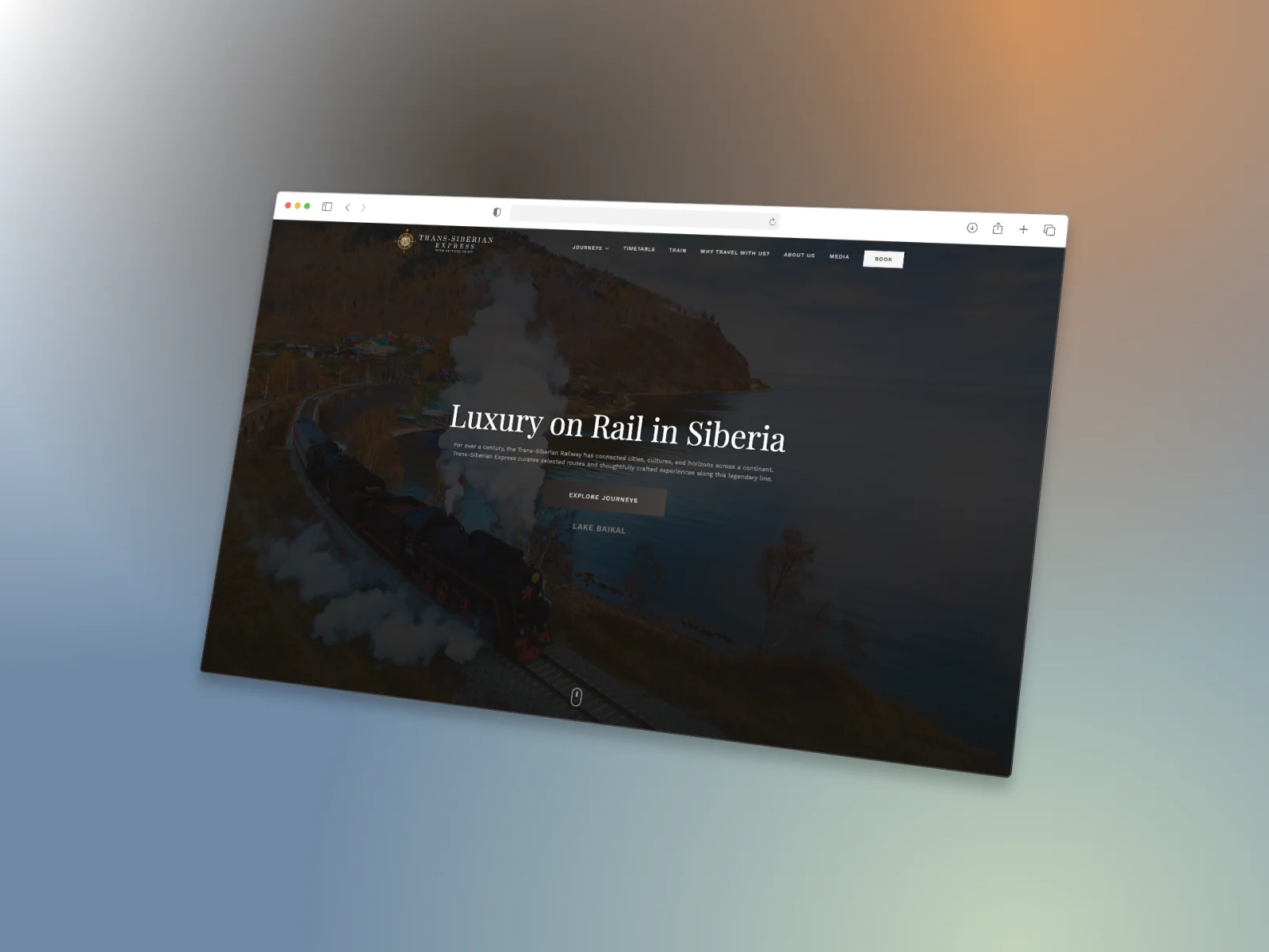
Project Context
Selling a long journey through a short decision
Trans-Siberian Express offers multi-day journeys by private train. On a trip of this kind, visitors do not read the site like a product page — they read it like a travel plan, wanting to understand the route, the days, the cabin and what is included all at once.
What was asked of us was a site that keeps the brand’s classic, calm tone while ordering the information around that reading behaviour. That is where the design started: route storytelling first, then dates and train detail, and the enquiry form at the end.
Scope
What the project covered
Screens
Page by page, where each one sits in the decision
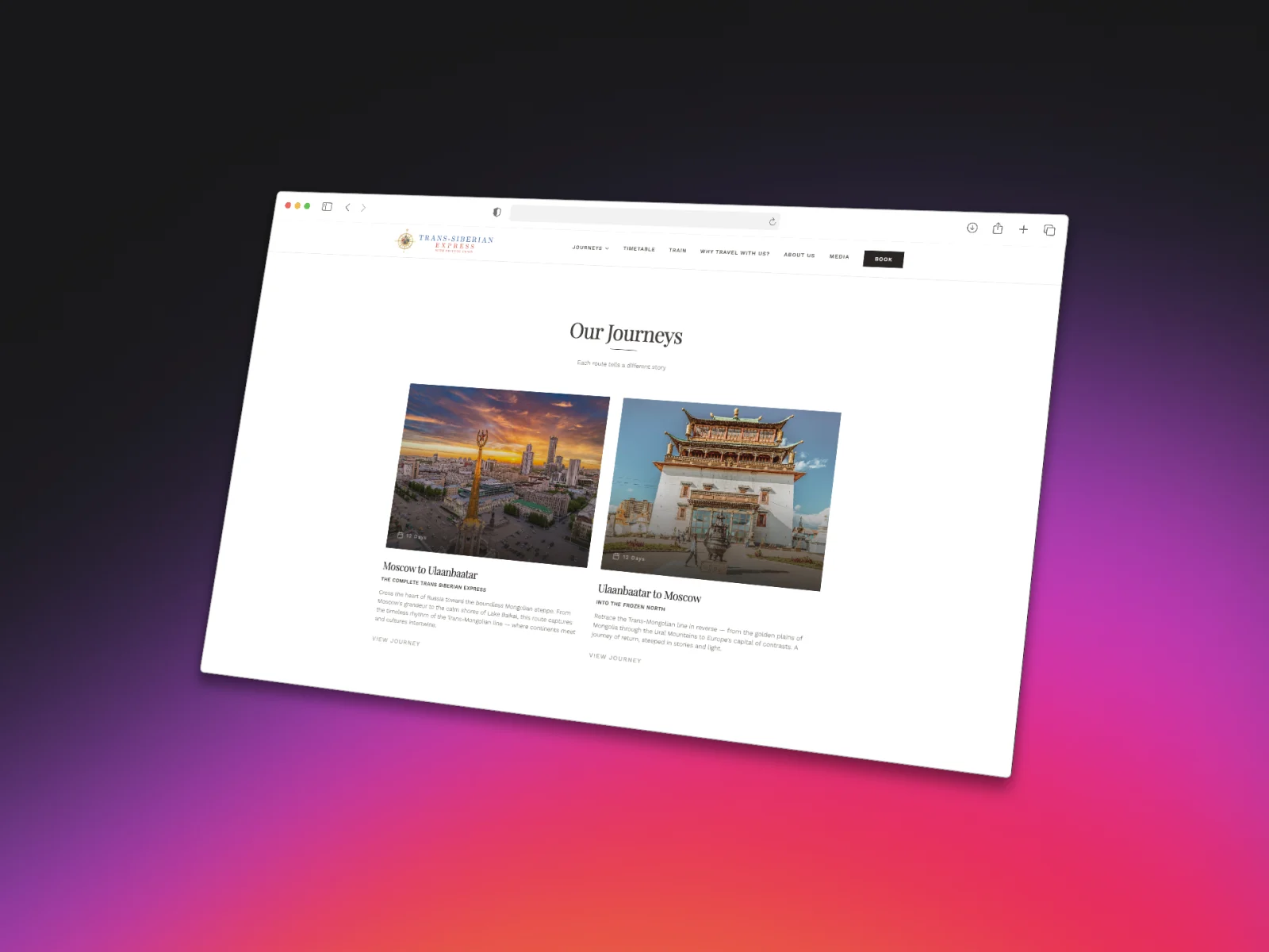
Journeys
Routes as a choice, not a catalogue
The visitor’s first decision is “which route”. So we reduced the journeys to cards that convey departure–arrival, duration and the character of the route at a glance.
Each card carries a large route photograph, the number of days and a short narrative, with a single link into the detail page. Comparing routes no longer means jumping between pages.
- Departure, arrival and duration on the card
- A short line that conveys the route’s character
- One click through to the journey detail
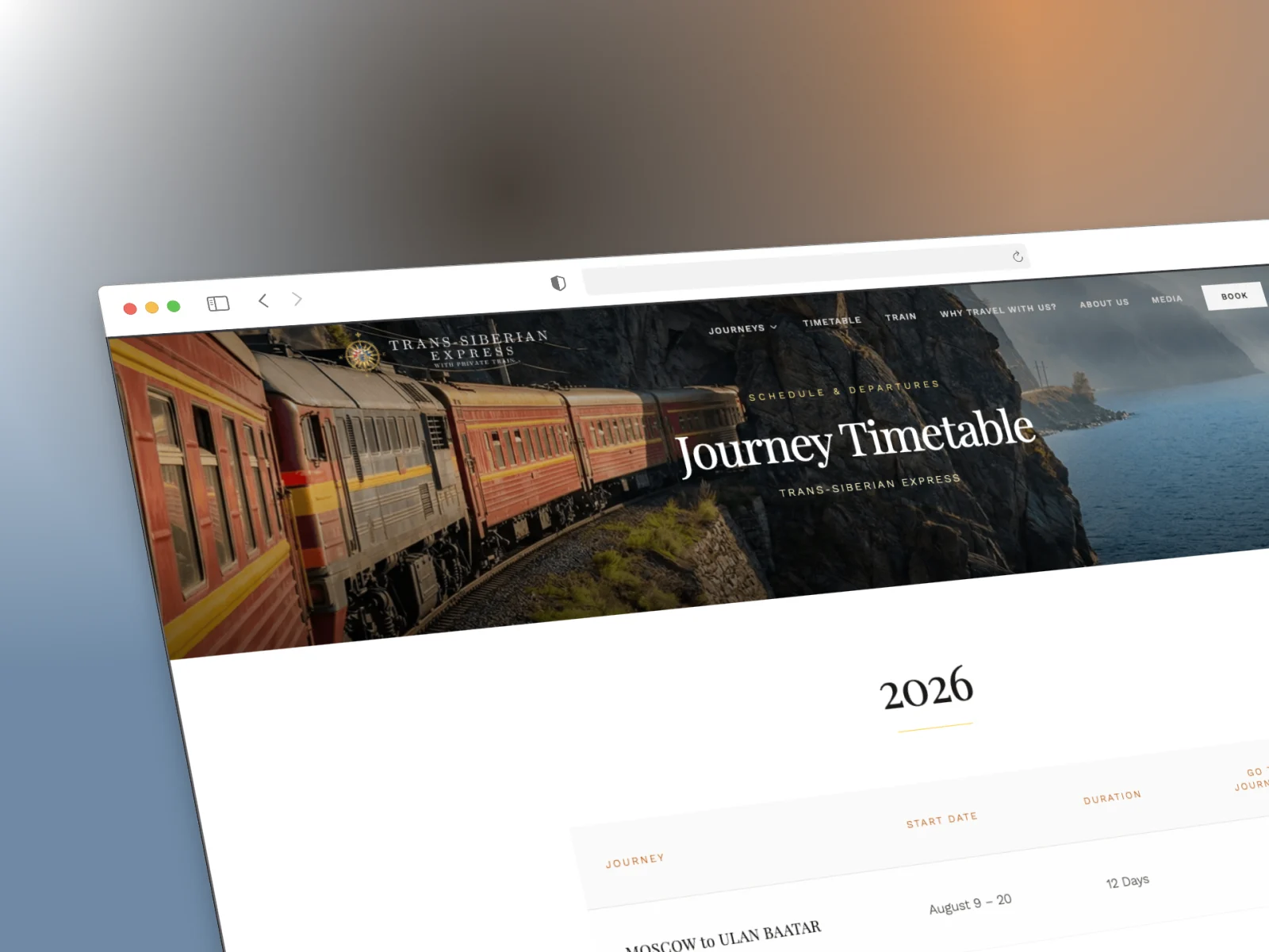
Timetable
One screen for the guest who is looking for a date
The timetable opens by year: each row places the route, start date and duration side by side, answering “when and how long” at a glance.
Every row ends with a link into the matching journey page, so the path from a date to a route never breaks. On mobile the table re-stacks in the same order, without side-scrolling.
- Departures listed by year
- Route, date and duration on one row
- Straight from a row into the journey page
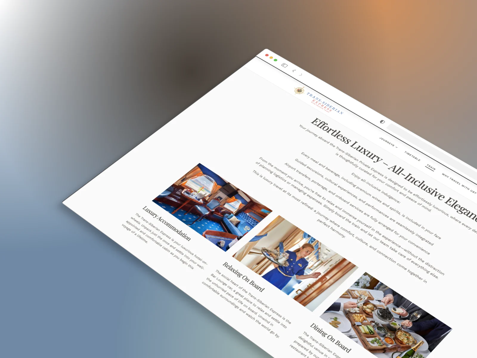
The Train
The best way to describe life on board is to show it
The train page splits accommodation, the bar-lounge and dining into image-led sections rather than walls of text: one photograph and a short paragraph explaining it.
The all-inclusive scope — transfers, excursions, food and drink — is stated plainly at the top, so guests learn what is covered before they scroll.
Booking Enquiry
The enquiry form works as the first step of the sale
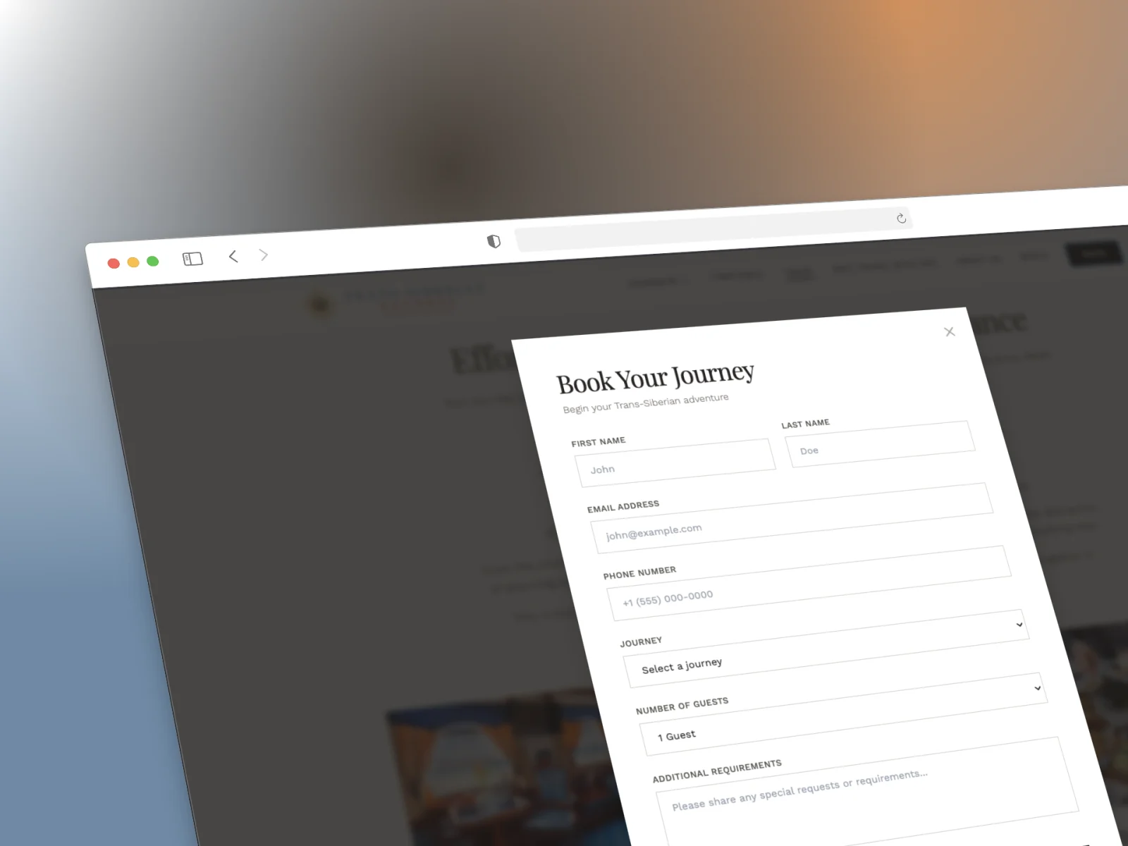
A journey at this scale is not bought on impulse; it starts with an enquiry. The form gathers name, contact details, chosen journey, party size and special requests on a single screen.
It opens over the page rather than navigating away, so the guest keeps their place and the sales team still receives a complete enquiry.
- Journey and party size as guided selections
- A free-text field for special requests
- Opens in place, without leaving the page